|
|
|
|
|
|
|
|
|
|
|
|
|
|
|
|
|
|
|
|
|
|
|
|
|
|
|
|
|
|
|
|
|
|
|
|
|
|
|
|
|
|
|
|
|
|
Art Gallery Of Mistakes
|
|
|
|
|
|
|
|
|
|
|
|
|
|
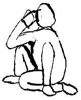
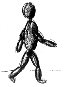
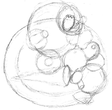
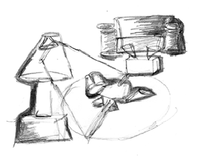
These two drawings were by two separate people and were featured at this scale on 8 1/2" x 11" paper. They had the right idea about having a single drawing on one sheet of paper but their structural anatomy leaves a lot to be desired. You're supposed to "draw what you see". Perhaps these two might want to look into getting some prescription eyewear as soon as possible.
|
|
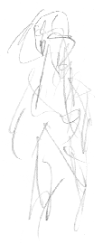
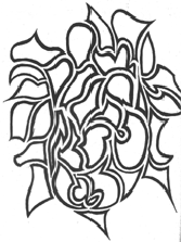
You could look at this as interpretive art or caricature. (Look closely at the upper part of the drawing and you can sort of make out a cartoonish face.) Unfortunately though, this was a series of scribbly life drawings attempting to be serious.
|
|
|
|
|
|
|
|
|
|
|
|
|
|
|
|
|
|
|
|
|
|
|
|
|
|
|
|
|
|
|
|
|
|
|
|
|
|
|
|
|
|
|
|
|
|
|
|
|
|
|
|
|
|
|
|
|
|
|
|
|
|
|
|
|
|
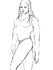
Here is a perfect example of bad photo reference. This is a guy drawing all the way. (I have a lot worse examples which for the sake of self censorship I can't show here). The fixation that males have in drawing the female form becomes a caricature in the submissions that I have seen over the years. I'm not trying to be sexist here, but the trend has been quite evident: males draw, large breasted women, muscular men / barbarians and demons,,, females draw, cats, horses, way too many unicorns and weird artsy-fartsy patterns...
|
|
|
|
|
|
|
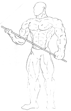
This is called "comic book art". The super-hero proportions of the muscles make this life drawing look very unnatural. I would go so far as to say that this is drawn from some photo reference out of a body building magazine. (Note the badly positioned right shoulder on the character, the overly thick ankles and calves, and the very badly drawn right hand).
|
|
|
|
|
...Why, just like this!
Now this really shows off your ability to...?
|
|
|
|
|
Draw Your Hand
|
|
|
|
|
|
|
|
|
|
|
|
|
|
|
|
|
|
|
|
|
|
|
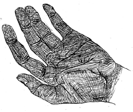
This should be pretty straight forward, right? Unfortunately, it's not. I've seen lots of the example above where the artist felt it was absolutely necessarry to draw every single last wrinkle and palm print. This is just creepy looking. The structure of the hand is a bit off around the fingers-to-palm connection but otherwise it's o.k. except for the CREEPY LOOKING WRINKLES!! It's just too distracting. For all the time you spend on the detailing, you could be fixing up the more important things like structure. No amount of shading or coloring is going to make a badly structured drawing look better structured.
|
|
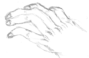
Unless you've actually had an operation to graft a monkey hand onto your wrist, don't do this. No, let me rephrase that. EVEN IF, you've had a monkey hand grafted onto your own wrist, don't do this.
This reminds me of the time this guy came storming into my office demanding to know why I didn't accept him into the program. My first thought was to call security to get this nut out of my face. Instead, I did the Mr. Nice thing and I sat down with him for two hours and went through his portfolio to explain what was wrong with his artwork. We went through all the life drawings and room perspective stuff, then we came to his two hand drawings. These things were all mangled up worse than the drawing shown above. So, I'm telling him all about the structural problems and he lifts up his left hand and says, "Well, what do you want!!? I got it caught in a lawn mower three years ago and this is the best they could do with it!!"
The drawings looked exactly like his mangled hand. So, I sheepishly said it would have been best if he had drawn someone elses hand instead. I don't think I've ever burst into a sweat since then, like I did at that moment.
|
|
|
|
|
|
|
|
|
|
|
|
|
|
|
|
|
|
|
|
|
|
|
|
|
|
|
|
|
|
|
|
|
|
|
|
|
|
|
|
|
|
|
|
|
|
|
|
|
|
|
|
|
|
|
|
|
|
|
|
|
|
|
|
|
|
|
|
|
|
|
|
|
|
|
|
|
|
|
|
|
|
|
|
|
|
|
Object Drawing
Draw some everyday objects from around your house
|
|
|
|
|
|
|
|
|
|
|
|
|
|
|
|
|
|
|
|
|
|
|
|
|
|
|
|
|
|
|
|
|
|
|
|
|
|
|
|
|
|
|
|
Just like the hand drawings, don't turn the portfolio assessment into a "Quiz Show" where we have to try to guess what it is that we're looking at. Some basic perspective might help at a time like this. Pick something simple, like a t.v. remote control, a can opener (both hand cranked and electric), a stapler, or hole puncher. Don't draw abstract objects like lava lamps or those really 'cool looking' computer speakers or your old Mickey Mouse telephone.
|
|
|
|
|
|
|
|
|
|
|
|
|
|
|
|
|
|
|
|
|
|
|
|
|
|
|
|
|
|
|
Next Page
Previous Page
Back to Portfolio Requirements
Good Stuff |
|
|
|
|
|
|
|
|
|
