|
|
|
|
|
|
|
|
|
|
|
|
|
|
|
|
|
|
|
|
|
|
|
|
|
|
|
|
|
|
|
|
|
|
More Good Stuff
|
|
|
|
|
|
|
|
|
|
|
|
|
|
|
|
|
|
|
|
|
|
|
|
|
|
|
|
|
|
|
|
|
|
|
Environmental Drawing
|
|
|
|
|
|
|
|
|
|
|
|
|
|
|
|
|
|
|
|
|
|
|
|
|
|
|
|
|
|
|
|
|
|
|
|
|
|
|
|
|
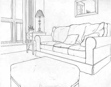
Nice, comfortable perspective here. The vanishing points are an appropriate distance apart. The environment looks structurally accurate.
|
|
|
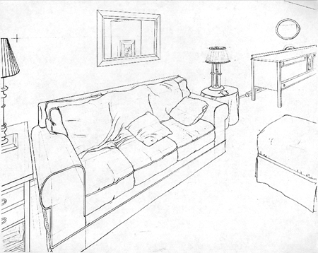
In this view, the perspective is forced a bit too much on the left side, creating a fish eye lens view. This distorts the dimensions of the objects in the room too much and makes it awkward comparing the two. The other problem here is that the views are not from opposing corners of the room.
|
|
|
|
|
|
|
|
|
|
|
|
|
|
|
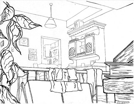
A nice sense of depth is created through the use of the thick and thin lines. Thicker lines for closer objects and thinner as they move away. The perspective is slightly off in the object on the right side of the picture, the top of the chair in the midground slants down a bit too much and the cabinet doors don't go to the same vanishing point as the rest of the cabinet. The lamp on the ceiling is a bit off too.
|
|
|
|
|
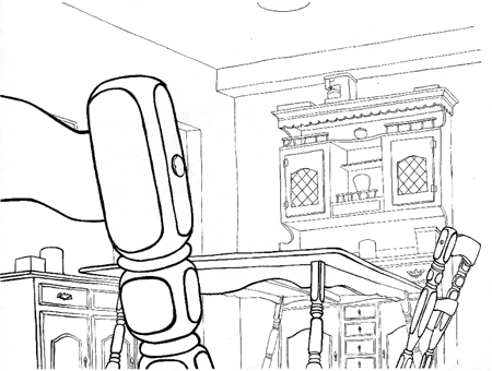
Again, this is not an opposing corner view. It really bugs me when people can't follow instructions properly. The chair in the foreground adds nice depth to the environment, but it's too low in relation to the other one on the right. The perspective on the doors are doing the same thing as in the other drawing.
|
|
|
|
|
|
|
|
|
|
|
|
|
|
|
|
|
|
|
|
|
|
|
|
|
|
|
|
|
|
|
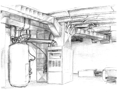
How can you not love a drawing of a furnace room? So many interesting geometric shapes. The ellipses on the water heater are the main problem in this drawing.
|
|
|
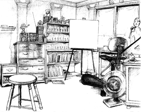
A nicely drawn room with just a few little structural errors, mainly in the stool and the chair. The base of the fan is a bit odd as well.
|
|
|
|
|
|
|
|
|
|
|
|
|
|
|
|
|
|
|
|
Next Page
Previous Page
Back to Portfolio Requirements
Bad Stuff |
|
|
|
|
|
|
|
|
|
|
|
