Some Common Perspective Errors
- Too many horizon lines
- Scale of objects change in relation to horizon line
- Weird proportions
- Horizontal lines not parallel to each other
- Vertical lines not parallel to each other
- Lines not going to a single vanishing point (in one point perspective)
- Lines not going to the two vanishing points (in two point perspective)
- Vanishing points too close together
- Too many vanishing points
- One vanishing point in the field of vision, but using two vanishing points
- Warping the perspective when it’s not necessary
- 3rd vanishing point too close to the edge of the field of vision
- Horizon line in the wrong place
Some Steps You Can Follow to Create the Best Layout Possible
1) Make a list of all the things you need to have in the layout
2) Is there anything else you could add to make it look cooler?
3) Do you have a good understaning of what it should look like?
Were you given specific instructions? One point, two point, three point - were you given a specific horizon line level? 3 feet, 5 feet, 6 1/2 feet?
4) Can you create a mental image of it in your head?
5) Draw a floor plan to block out the scale and where everything is going to go.
6) Get onto the internet and do some image searches for the things you'll be needing to draw within the environment.
7) Save the images to your computer. Maybe create a document with the images so you can print it out and have it handy while drawing.
8) Daydream about the environment. Take a little walk through it in your mind. Move things around.
9) Do a thumbnail sketch of the point of view you see in your head.
10) Now, fix the perspective (see common errors above).
11) Do another thumbnail from a different point of view, or change the position of things in the environment.
12) Fix your perspective again.
13) How does Brian know this is happening??
14) Draw another floor plan and then do another thumbnail.
15) You know...
16) Choose the best composition. Ask yourself:
What is the focal point?
Where do I want the audience to look?
Do I have strong foreground - midground - background elements?
What can I fix to make this better?
Is my perspective right? One point, two point, three point, warp?
What kind of shot is this? Long, Medium or Close-up?
Up-shot? Down-shot? Straight-on?
Where is the horizon line? High, middle or low? Off the page?
Am I using the rule of thirds? Do I need to?
Is it an action shot or passive?
Is there a character in the scene? Where would they be? Do they need to move around? Do they need to interact with the background or a prop within the scene?
How high is my horizon line (in feet or inches).
Is everything working to this eye level?
Is everything proportioned properly?
17) Fix whatever needs to be fixed in the thumbnail format.
18) Remember: "Thumbnail" means small and simple - basic shapes... no details. Perspective must still be accurate!!!!
19) Show it to someone for feedback. Do they get it?
Is the composition clear and understandable without a bunch of clutter?
Is there an emotional context to the shot? If so, what is it? Happy, sad, scarey, shocking, mysterious, awe inspiring, ___________?
Do they have any suggestions? Are they valid? Should you make changes? Will it make your layout better?
20) Adjust as necessary.
21) rough out the basic perspective at full size.
22) Check it with the thumbnail. Is it the same or did you change it to make it worse?
23) Maybe scan the thumbnail and enlarge it to the full size so you can keep it the same.
24) Be sure the perspective is working properly. If it isn't, everything your draw from this point on will be wrong and you'll have wasted your time.
25) Create grids for the basic planes: floor and any walls. Use a scale if it helps - 1 line = 1 foot or 2 or 4 or whatever.
26) Start adding elements as basic boxes first. make sure perspective is correct - think.
27) This is a lotta steps isn't it?
28) Start adding details - still in light rough lines. (remember, "rough" does not mean "sloppy" it means "lightly drawn in without commiting to a final line") Are they in proper scale to the environment and horizon line? Is the door the right height? is the chair the right size? etc.
29) Go pee.
30) Step back for a moment and look at what you've drawn so far. Does it look good enough? Make any adjustments at this rough stage before moving on to "clean-up".
31) Refer back to your reference material. Add any details necessary to form the final shape of things.
If you're happy with your rough at this point, you can now move into "clean-up" mode.
32) Start with the things that are closest to you the viewer and work your way back into the environment. This will cut down on any unnecessary erasing. Things that are closer to the camera are bigger and have more detail. Be sure to make it look accurate and solid as the viewers eye will most likely go there first. Sometimes, I like to use pencil line thickness to bring the things in the foreground forward. Don't make the lines huge, just a little thicker than normal.
33) As you move back into the environment, you can have less and less details, depending on how far back the object is. Use your own judgement here. Also make the lines thinner to get them to fall away. I didn't say "lighter", I said "thinner".
34) Add in the background elements to finish off the drawing.
35) Go back and look for any disconnected lines. Make sure everything looks solid.
Now step away from the drawing. Go do something else. Come back in an hour and look at the layout with fresh eyes. Anything you could do to make it look better? Adjust some bad perspective? Add more detailing? Start all over again?
Always remember that you should be thinking about every line that you draw. What is it there for? What does it represent? Should it be over here a bit more or over there? Is it going where it should? Think, think, THINK!
Try not to get distracted when you draw. Focus on the job at hand. This is what separates amateures from professionals.
Here's a basic rubric for your layouts.
One thing to remember when looking at the rubric and your grades: each category is linked together and effects the other grades.
For example, if your effort is very high you will most likely have much more detail and "stuff" in the drawing and so there is more room for errors. You could get a 2.25 for Effort, but because you have a ton of Perspective mistakes your grade could be a 1. If you put very little Effort in, you might get a 1.25 but then your Perspective grade would drop as well because there isn't as much stuff to go wrong with. Typically, the Perspective grade is either "the same as" or "less than" the Effort grade and rarely would it ever be higher, even thought there may not be any errors in what little you have drawn.
The Depth and Composition grades are similarily linked to each other but will not be effected by the Effort and Perspective grades. You can have a very nice camera angle and good foreground, midground and background elements with a grade of 2.25, but still have very little Effort and bad Perspective giving you 1 for each. This can result in a final grade of 6.5 whish seems pretty good, considering 5 is the passing grade, but the final visual result may not "look" like a 6.5 but rather a 4.5 in comparison to other layouts submitted.
Also, you need to be aware that the grades are comparative to all the other submissions and you are given "allowances" for your present levels of ability. By "allowances" I mean, I'm not expecting "Michealangelo quality" drawings from you at this stage of your learning curve. As you progress through the year and get better and better, my expectations will rise with your abilities and I will grade harder towards the end of the year. An assignment that gets an 8 at the beginning of 2nd semester might only qualify as an 5 by the end of the semester (but don't worry, I won't go back and change the grade).
Basic Perspective Angles
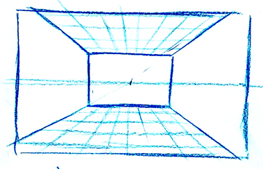
Here's your standard one point perspective view with the horizon line in the middle and the vanishing point in the middle.
If we pretend that all these drawings are of us in a room, let's assume that the ceiling is the standard 8' high, that means the horizon line is at 4' in this view.
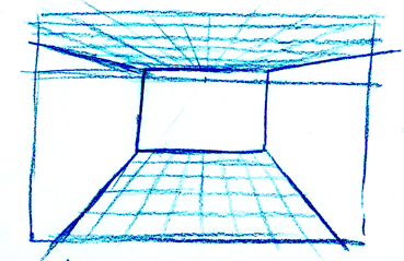
This view moves the horizon line up closer to the ceiling around 7'.
It also moves the horizon line higher within the field of vision, which means we are looking down slightly - we can see more floor than ceiling here.
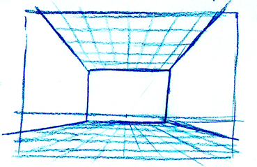
This view places the horizon line down to the floor around 1'.
The horizon line is also moved lower within the field of vision, which menas we are now looking up slightly - we can see more ceiling than floor.
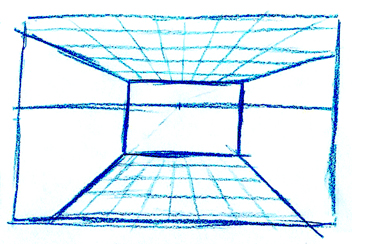
In this view, the horizon line is around the 6' eye level and more towards the center of the field so we almost see an equal amount of floor and ceiling.
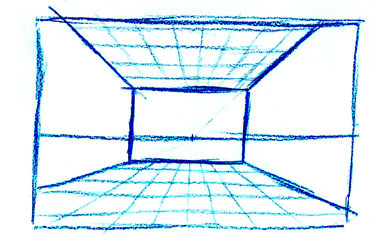
Here, the horizon line is lowered to about 2' off the floor, again with the horizon almost in the center of the field.
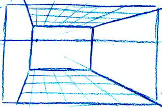
In this view, the horizon is at about 6' and slightly above the center of the field, but the vanishing point has now been shifted over towards the left wall.
It's as though we have walked towards the left and are still looking straight at the back wall of the room.
The wall to our left is coming right at us, we could just reach out and touch it with our hand. The far right corner of the room has moved closer to the center of the field.
Although we are on the left side of the room, we've turned our head slightly to the right towards the corner.
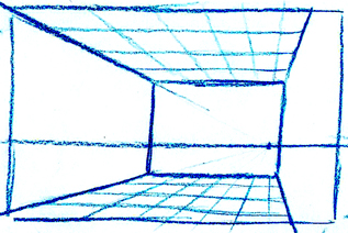
Here, we're lower to the ground about 2' off the floor. We've moved to the right of the room and have turned our head slightly to the left.
The ceiling and floor line of the far wall are still parallel to the horizon line.
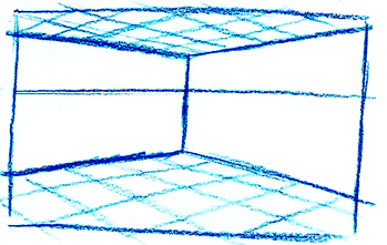
Now, we've moved ourselves right back into the corner and are looking across the room into the opposing corner.
The horizon line is at 5' or 6' and is slightly above the center of the field, so we're looking down just a bit.
This is using two vanishing points. One is outside the field of vision to our left and the other is to the right.
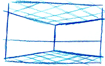
Standing in the same corner, we've just crouched down to about 2' - 3' off the ground. Still using two vanishing points.
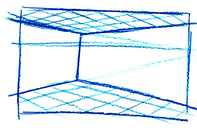
About 6' off the ground and turning our head to the right just a bit.
The vanishing point on the right side is moving in closer to the edge of the field of vision but is still outside.
The vanishing point on the left side has moved further away to the left.
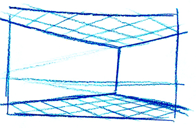
Now 2' off the ground looking to the left a bit.
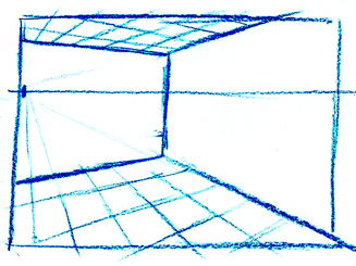
I'm now walking along the wall behind me but still looking into the corner across from me. This begins to introduce the vanishing point on the left into my field of vision. I've kept the right vanishing point close, just outside the right side which starts to force the perspective on the ground to look weird.
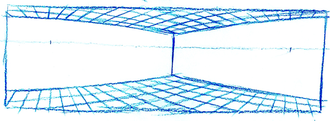
By widening out my field of vision on either side, it introduces the vanishing points. I've had to bend the perspective lines to try to make it work. This is called "Warp perspective". It looks more correct if you use your hand as a viewfinder (like a telescope) and move it across the drawing from one side to the other. The more you narrow down the field of vision with your hand the better it looks. See how the walls pull towards and away from you as you "pan" across it?
Neat huh?
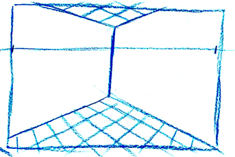
Here's what happens if you pull the vanishing points too close together on the edges of the field. It makes the walls close in on you. The rule here is: the closer your vanishing points come together, the closer you are to the corner of the room or object.
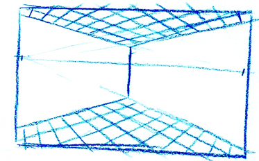
In this version, the vanishing points are still just inside the edges of the field, but I've moved the corner of the room further back. It's better in the corner, but the floor and ceiling begin to pull down as the lines get closer to the vanishing points.
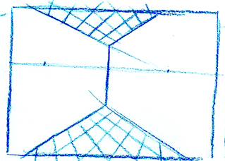
Here the vanishing points are way too close together forcing the floor and ceiling to fall away dramatically on the sides.
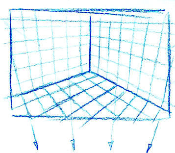
For this view, I have raised the horizon line within the field and kept the two vanishing points just a bit outside the field.
For the walls, I've tilted them towards a new vanishing point straight below the corner of the room. This is the third vanishing point that sits right between your feet when you look down at the floor.
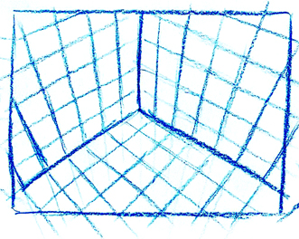
The more you look down, the higher the horizon line moves up outside the field of vision and the closer the third vanishing point moves up towards the bottom of the field. The two vanishing points on the horizon line will also start to move in towards the sides of the field.
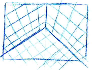
The more you look down, the higher the horizon line goes and the two vanishing points begin to form a 90? angle at the corner of the room along the floor lines. The third vanishing point continues to move up closer towards the bottom of the field.
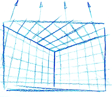
If we look up towards the ceiling, the horizon line begins to drop out the bottom of our field. We start to introduce the third vanishing point that is straight above our head when we look directly up at the ceiling.
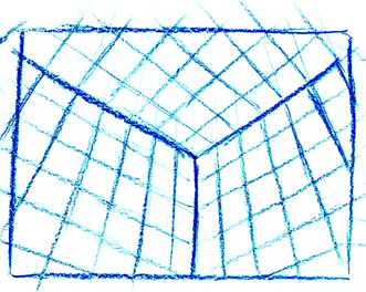
The higher up we look, the further the horizon line drops down and the vanishing point above our head comes closer to the edge of the top of the field of vision.
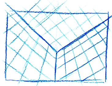
The corner of the room starts to become a 90? angle where the ceiling and walls meet.
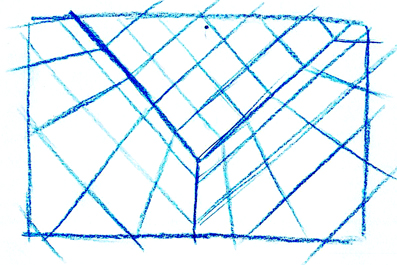
Once the vanishing point enters the field of vision, it turns back into one point perspective. We're looking straight up at the ceiling... or...
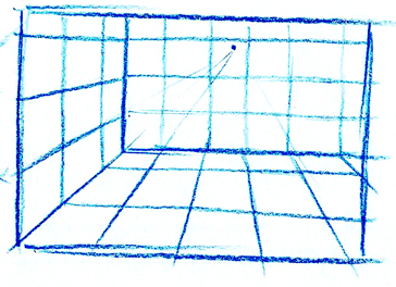
...are we looking down towards the floor into the corner of the room? Or...
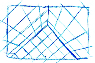
Are we looking straight down at the floor into the corner? Hmmmmmm.
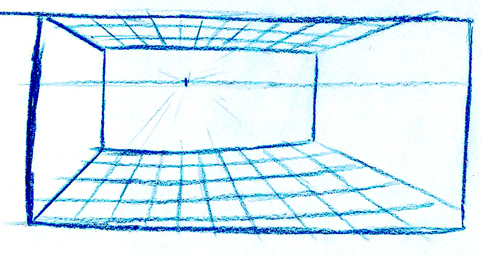
Here's a variation on the warp perspective where I've widened out the field a bit and using a single vanishing point for the central and left side of the room but then bending the perspective for the right side as it moves beyond the edge of a normal field. This is very similar to the two point warp drawing.
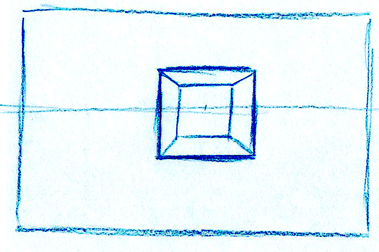
Now if we think about an object in the shape of a square, we can follow the same basic rules for horizon line and vanishing point placement.
If we are looking straight on at the front plane of the box we will have a vanishing point in the middle on a horizon line that also splits it down the middle.
The object can be any size you want, just give it a measurement in inches or feet.
You can also change your point of view on the object. We could be looking at it from straight above or below.
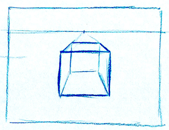
By shifting the horizon line slightly above the box we can now see the top surface as well as the front (I've drawn all the lines on as though it's a see-through box for these examples).
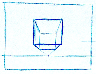
Placing the horizon line below the object lets us look at it from underneath.
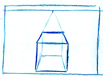
The higher we move the horizon line, the more we look down on the top of the box.
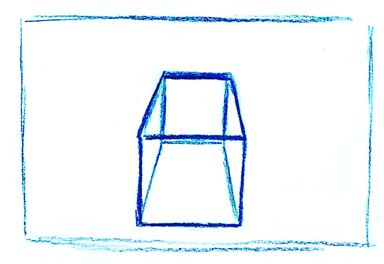
The box continues to rotate more. The problem here is that the front surface of the box is made using parallel lines both vertical and horizontal. This means that the distance of the middle edge of the box appears to be the same distance as the lower edge (since they are the exact same width). Visually, this is incorrect as the middle edge is the closest edge to the viewer and the top and bottom edges are further away. This must be described with lines that are smaller as the Primary Rule of perspective is: The closer something is, the larger it appears, the further away, the smaller it appears.
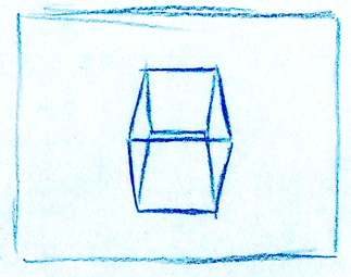
To solve this, we need to introduce a second vanishing point below so that the parallel lines of the front face can appear to recede into the distance. This drawing now pulls the edge in the middle closer to the viewer and pushes the upper and lower edges further away.
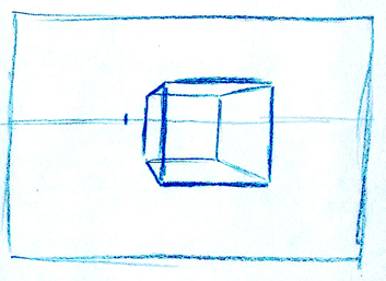
If we place the horizon line in the middle of the object but shif the vanishing point to the left, we can now show the outer left plane.
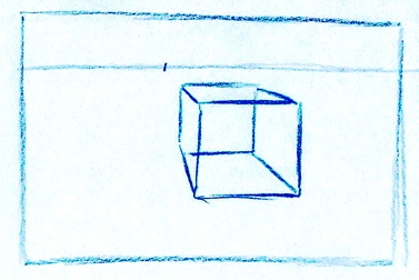
Keeping the vanishing point off to the left but raising the horizon line now reveals three sides of the box: top, left side and front.
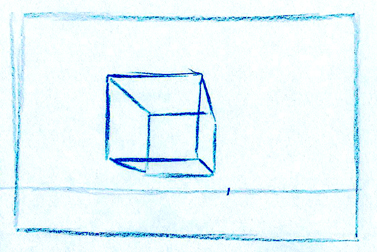
Placing the horizon line low and the vanishing point to the right shows the bottom, right side and front sides.
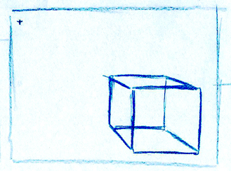
The further we move the horizon and/or vanishing point away from the box, the more of the side and top we can see.
The front plane lines remain parallel to the horizon line and at a 90? angle vertically.
Remember: The lines can only go in 3 directions!
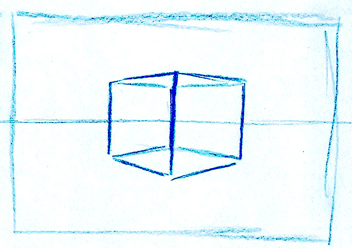
Once you rotate the box to 45? to the viewer, you must introduce the second vanishing point.
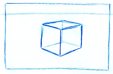
Placing the horizon line above introduces the third side. In this case the top edge.
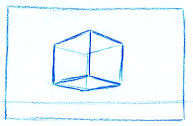
Placing the horizon line below shows us the bottom side. The two vanishing points are outside the edge of the field of vision. Don't forget the rule: The closer you are to the object (or corner of the object/room) the closer the vanishing points come together. The further away, you need to spread them apart. You can't have two vanishing points in the field of vision together at the same time.
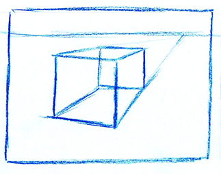
When you do introduce the vanishing point inside the field of vision, you should slide the second point out further. This shows a more natural two point rather than having the front plane parallel to the horizon line.
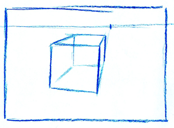
Even if the single point is very close to the outer edge, you can still cheat the front plane to a second point way, way off the edge of the field. This keeps the corner closest to us slightly larger than the other two on the left and right sides.
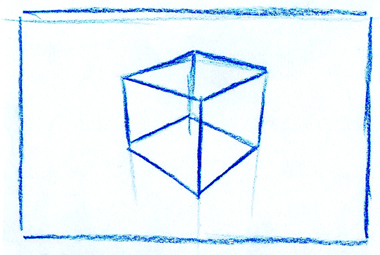
Once the horizon line goes outside ofthe field of vision, you can take the vertical lines down to a third vanishing point, straight below the center corner edge. This point is that one that is directly between your feet when you look down at the floor.
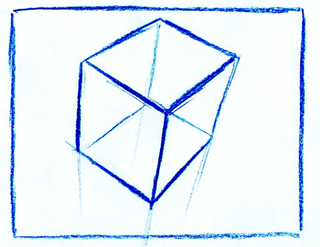
As the box rotates (because you are moving to a position above it, looking down) the horizon line continues to move up and away from the top edge of your field of vision, while the third vanishing point moves up towards the bottom of the field of vision. This pulls the center corner of the box towards us and pushes all the other corners away.
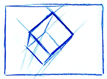
As you present more of the top surface the horizon moves higher and the third point moves up. The corners of the top surface begin to form 90? angles and the surface looks more square.


Once the vanishing point enters the field of vision, it turns back into one point perspective again. It looks like we're now looking straight down at the object.
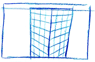
If we pretend the object is now an office building we can follow the same rules. Here the horizon line is right at the edge of the top floor. We've introduced a third vanishing point to get the lower floors to recede away a bit as though we're also looking down slightly. It also pulls that top corner in the middle closer to us.
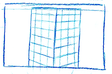
If we keep the lines parallel, it pulls us away from the tower.
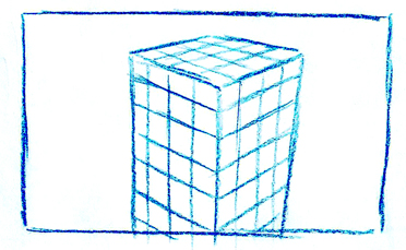
Here the horizon has moved up a bit so we can see the top of the building. Again, the third vanishing point gives us a slight downshot.
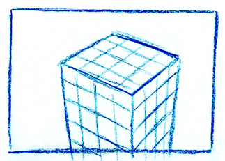
The further we move the horizon line up, the more we look down on the tower.
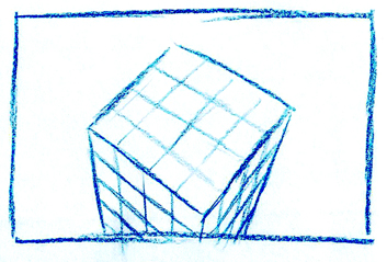
Looking down even more. Pulling the third vanishing point up closer to the bottom of the field.
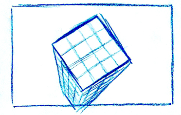
Almost looking straight down. We could see the streets at the base of the tower.
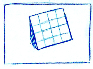
Now we're practically right on top of the building looking down. The vanishing point has entered the field of vision, so it turns back into a one point drawing again.
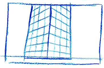
Now we're down on the ground floor looking up slightly.
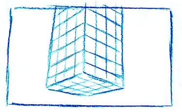
Uh oh! The building seems to be taking off.
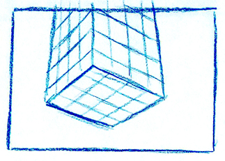
Gravity has been repealed.
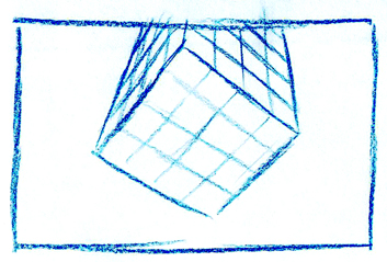
Now we're moving right underneath it looking up.
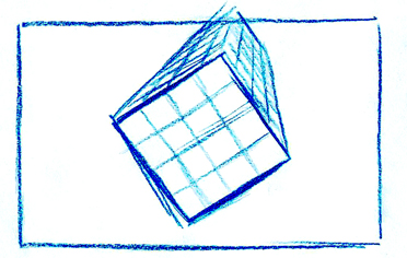
Yikes!!!
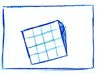
Back to one point again.
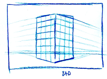
You need to be really careful with your perspective drawing. If you get sloppy, it can look really bad.
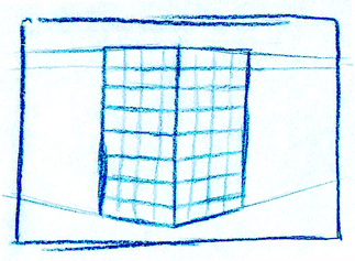
Here's our tower again with parallel vertical lines. This pulls us further away from it.
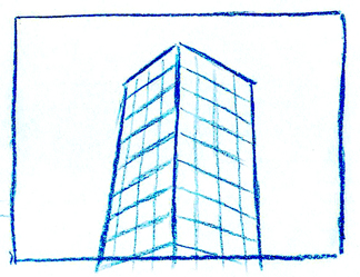
Placing the horizon line way below the field of vision and introducing the third point way up above gives us an upshot on our tower.
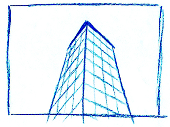
By pulling the third point down and moving the two lower vanishing points closer together, it creates even more of an upshot.
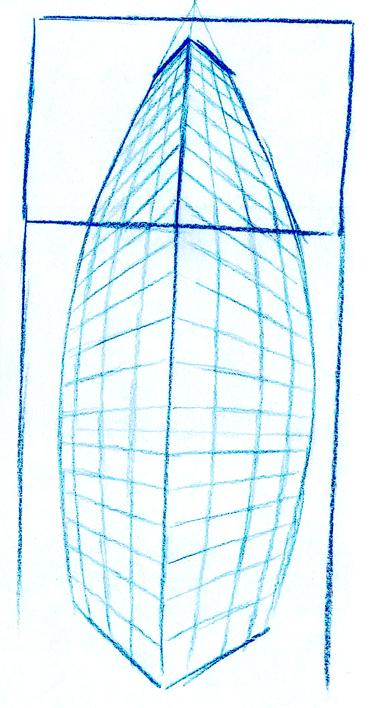
If we add some warp perspective to the bottom we can create a cool image as though we are looking up at the top of the tower and then we look down towards the street. Use your hand like the telescope to close off your field of vision. Start at the top and move your way down. Cool huh? You can also start at the bottom and move up to the top.
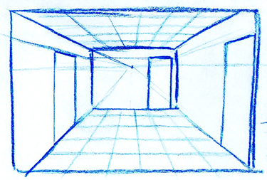
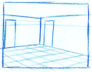
Now back to some boring inside of the room stuff.
Whatever the point of view you choose, as soon as you begin adding stuff to it, you need to maintain a sense of consistant scale. If you show a room that is 8' high, the doors need to be in scale at 7' (the normal height for a door). If you have more than one door in the environment, they all need to look like they're the same size.
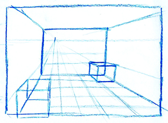
The same goes for any objects that you place inside the room. Be sure they work in scale to each other and the room.
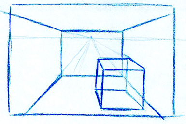
If you stick a box in a room, be sure it works to the same horizon line or it might appear to float off the ground.
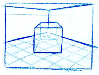
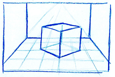
You can have objects that work to different vanishing points like this one point box in a two point room or the two point box in the one point room. Again, just be sure they are on the same horizon line and it makes sense. Most pieces of furnature in a room are typically parallel to the walls, especially if they are right up against the wall. You know, stuff like shelf uits, desks or a couch. Chairs can be placed at angles to make conversations easier. Use your best judgement and interior design skills to decide what looks and works best for the set you are drawing.
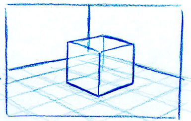
Be careful when you move the horizon line out of the field of vision to be sure you know where the vanishing points are so the object stays grounded properly.
Some Basic Composition Things
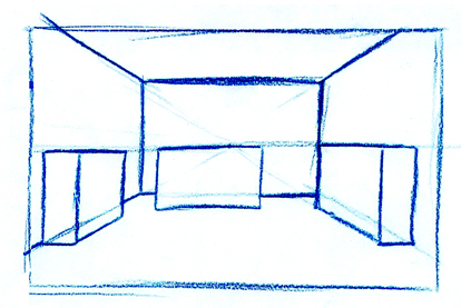
In a really simple setup like this, you should avoid placing the vanishing point in the middle of the wall as it creates a symmetrical composition.
Also avoid placing the horizon line right along the top edge of any object as it will flatten it out.
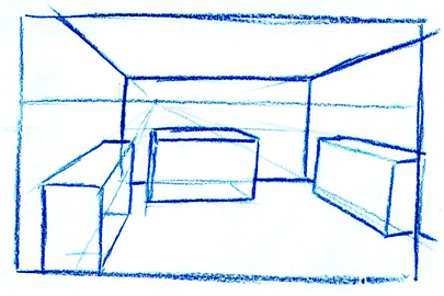
Shifting the horizon line up a bit and sliding the vanishing point off center creates a slightly more interesting composition. I've also raised the horizon line within the field of vision to create a slight downshot. I've also taken about one step closer so the box on the left so the bottom edge just falls out of the field.
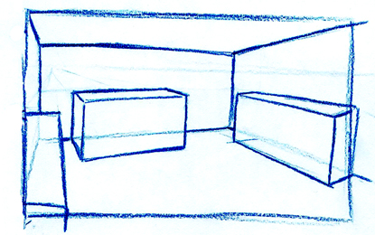
In this version, I've shifted myself more to the left, taken another little step forward and turned my head just slightly to the right to introduce a second vanishing point. This gives the corner more depth and makes things less parallel to the horizon line.
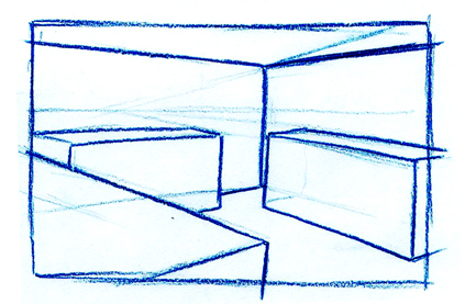
Here, I've taken another step to the left, so I'm right up against the wall. I've dropped the horizon line to about 5', moved in closer to the box on the left and turned my head so I'm looking right at the corner of the room. I've changed the spatial relationship of the box on the right. It's too close to the middle of the room and should be pushed back a bit.
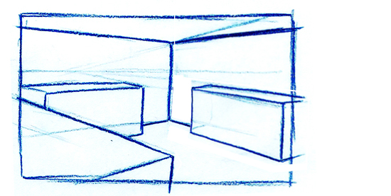
More like this.
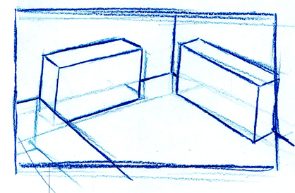
This view raises us up high, close to the ceiling and looking down into the corner. This point of view should be reserved for out-of-body experiences, surveilance cameras or someone stuck inside a ventelation shaft.
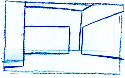
Here, I've dropped the horizon line so it looks like we're trying to hide behind the box on the left. This would be o.k. if you didn't want to see a human character's face standing in the room, or if you are a mouse and this is a shot of you trying to run across the room. You'd need a lot of surface detailing for this to read properly. It's a very dramatic camera angle that should be used only when absolutely necessary.
Some Practical Applications
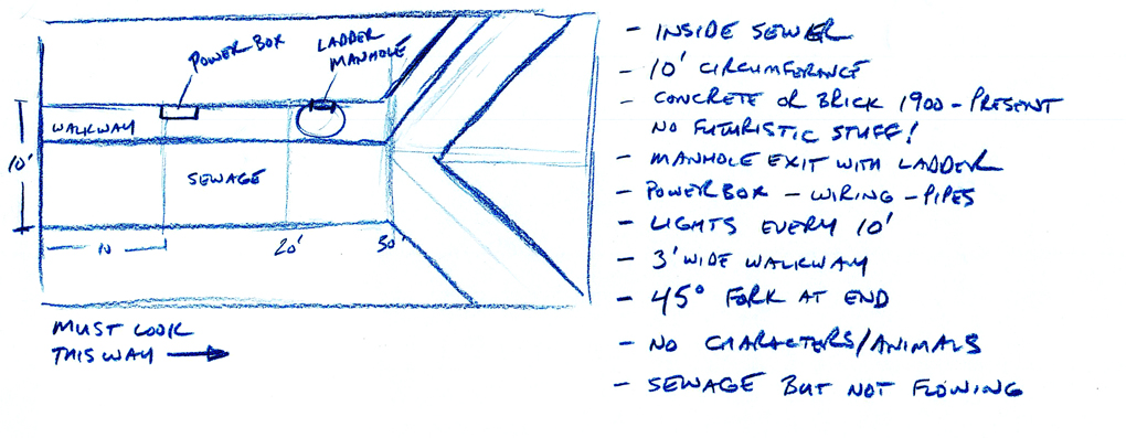
Let's take the Sewer Assignment.
Here's how the assignment was given out and my little floorplan of basically how it could be set up. You can shift the ladder and powerbox around to wherever
you want or you can put the walkway on the opposite side.
Since this is a confined space (as any room is), you're limited to a one point perspective view or a two point warped pan if you want (more about that later).
Let's look at some basic options as far as vanishing point and horizon line go.
The tube is 10' in circumference, so we're limited to that space.
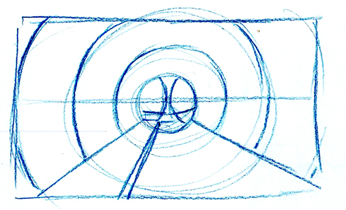
Here's the first basic option: horizon line in the middle at 5' and the vanishing point dead center.
Boring.
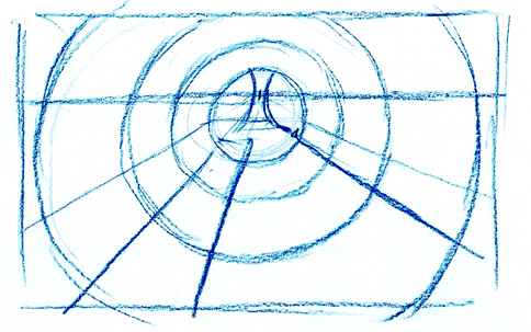
Option #2:
Raise the horizon line in the tube and within the field of vision to create a bit of a downshot. Vanishing point still in the center...
Still boring.
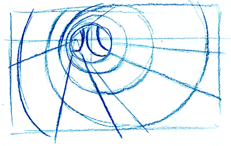
Option #3:
Horizon just above 5' and shift the vanishing point to the left over the walkway as though we are standing on it. A bit more interesting.
At least it feels like we're standing inside the sewer.
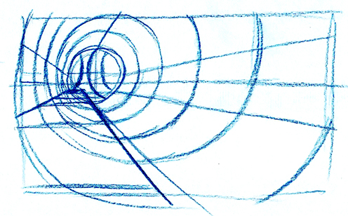
Option #4:
Let's drop the horizon line down to about 3' or just about 1' above the walkway.
This is much more dramatic. It pulls the walkway right into out face creating a much stronger feeling of depth.
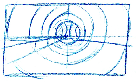
Option #5:
I've slid us over to the right into the sewage with a horizon line just inches above the walkway.
This gives us the feeling that we're crawling through the sewage with our face just above the surface... ewwww.
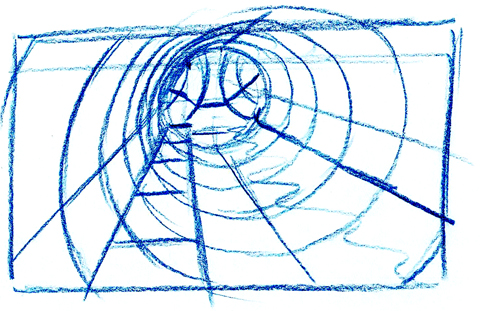
Option #6:
Now were up high over the walkway looking down more. A bit of an out of body feeling. More room for a fight to take place.
We could add a light fixture to the ceiling just off to the side of our face to create a cool foreground element.
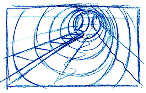
Option #7:
This swaps us over to the other side, floating over the water. It gives us mor space to see someone walking along the walkway.
Again, a light fixture right beside our head in the foreground would be cool or maybe the Power box.
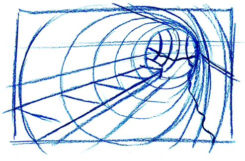
Option #8:
This is a slight variation of #7 where we push our head closer to the edge of the tube and bend the wall a bit to the right.
Let's try the same thing on the opposie side...
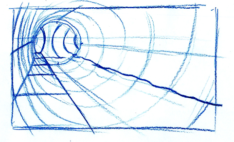
Option #9
So I've lowered the horizon line slightly and we're now over the walkway again. This one is halfway between Option #3 and 4.
How about if we extend the field down and to the right and add some warp perspective...
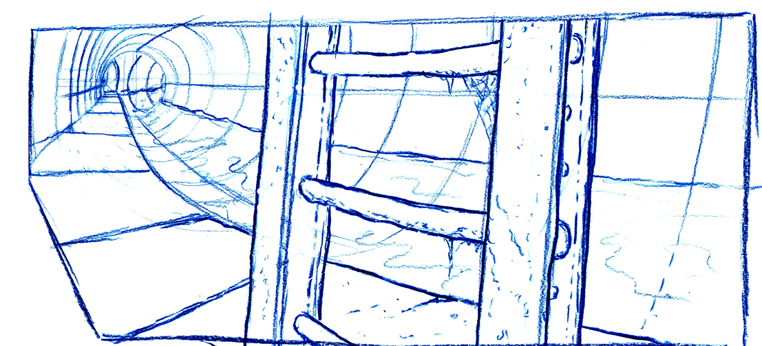
Option #10
I put the ladder up to the manhole really strong in the foreground as though the camera is positioned just behind it, against the wall.
You would start with the fielding similar to what is in Option #9 and then truck out and pan across to the right.
If I wanted to, I could keep on going even further and pan right over to looking down the opposite end of the tunnel, like this:

Option #11
This opens it to a wide pan.
The electrical box wires on the wall at the right end are coming right into your face which really adds to the overall depth of the shot.
Use your telescope hand to view this from one end to the other.

Option 12
Here's my final layout with a bit of simple tonal rendering.